I have always loved working on UI. It is so much fun building creative and attractive UI for websites to make them pleasant and appealing to the users. This is a how-to blog post on building a curved header for a website. You might have come across this design on a few websites out there. It's very simple, neat and attractive.

In this blog post let us explore various ways we can build a Curved UI header.
Approach 1 : Using SVG
SVG is used to define vector-based graphics for the Web in an XML format. It is a W3C recommendation and is an open standard. We can create circles, ellipse, rectangles, and also complicated shapes like a bunny, a star, etc with SVG using the right commands and parameters.
For the curved header, we will be using SVG Path. The <path> element in the SVG library can be used to create lines, curves, arcs, and also more complex shapes combining lines or curved lines. There various line commands that can be used to create a path.
Line commands
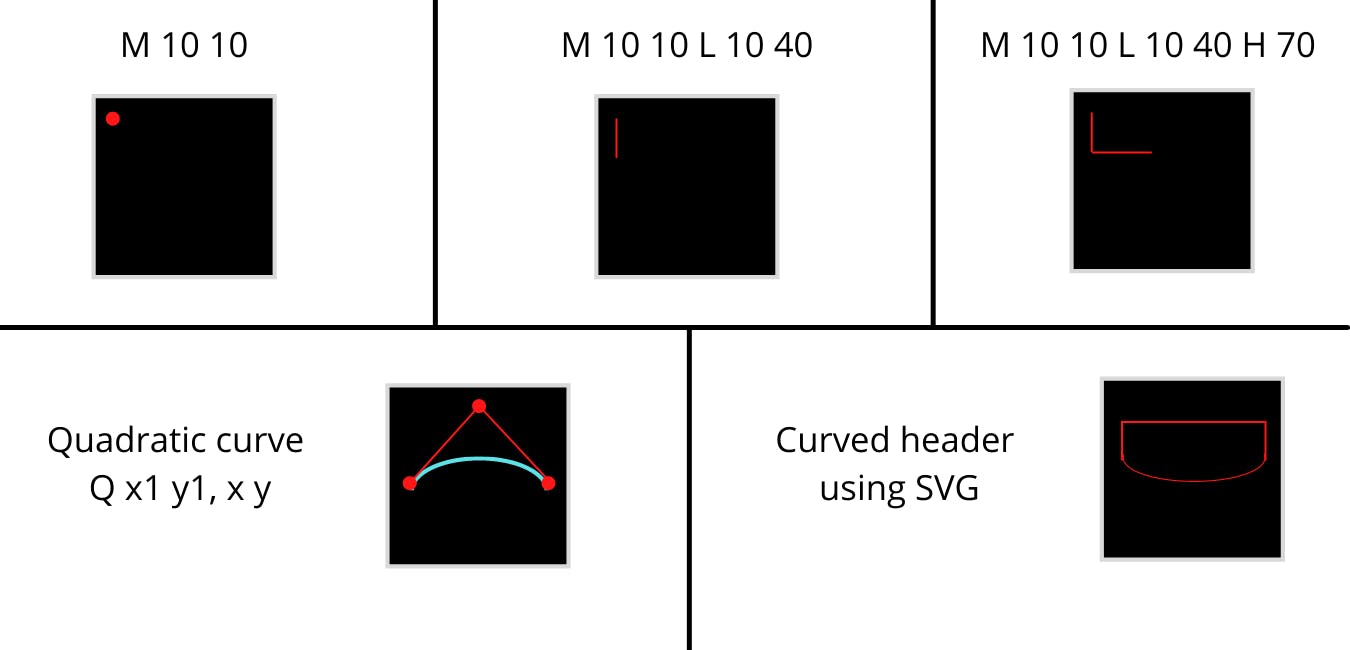
The first one we will be using is the "Move To" or M. It takes two parameters coordinate (x) and coordinate (y). So, if our motive is to move to a point (30,10) the command used is M 30 10 .
The next command is L or the "Line To" command, which takes in x and y coordinates as parameters. Its function is to draw a line from the current position to the next position. We also have H and V which are used to draw Horizontal and Vertical lines respectively.
The last line command is Z or "Close Path". This command draws a straight line to close the path. A line from the current position to the first position which closes the whole path is drawn using. This command does not take any parameters.
Curve commands
Now let us see options for creating a curve. To draw the curved header, in this article we will be using Bézier curves. There are many other ways to do this as well by using ellipse, circle etc.
We will be using a type of Bézier curve, the quadratic curve called with Q. We can also use a Cubic curve, but I find it easier to use a quadratic curve as it only uses one control point whereas a Cubic curve uses two control points.
Refer to the image below for a pictorial idea of how paths can be created using all the commands discussed above.

For the curved header, we will use Move To, Line To, Quadratic curve and Close To commands. Below is the SVG code for creating the header.
<svg xmlns="http://www.w3.org/2000/svg" width="1500" height="600" viewBox="0 0 1500 600" preserveAspectRatio="none">
<defs>
    <linearGradient id="myGradient" gradientTransform="rotate(45)">
      <stop offset="5%"  stop-color="#fc6767" />
      <stop offset="95%" stop-color="#ec008c" />
    </linearGradient>
  </defs>
  <path d="M 0,0
         L 0,300
         Q 750,600 1500,300
         L 1500, 0
         Z" fill="url('#myGradient')" />
</svg>
We start with M 0 0 as the starting point. A vertical line is drawn from point (0,0) to (0,300) using the "Line To" command. We now draw the curve using Bézier quadratic curve Q. The curve starts from the current position (0,300) and ends at (1500,300) having the control point at (750,600). We then draw a straight vertical path from the current position to the top of the window. Then close the path with the command Z.
A live demo using the above SVG commands is here in this code pen.
Approach 2 : Using CSS property border-radius
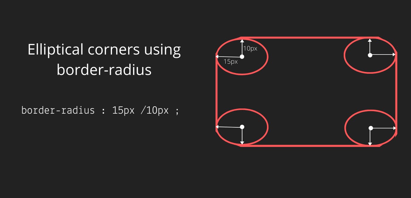
border-radius is a CSS property that is used to round corners of a block. We can give a single radius to circle the edges. Also, we have the option to give two radii, by which we can have elliptical corners.
Below are a few examples of how we can use border-radius by providing different values as parameters.
/* Radius is set for all 4 sides */
border-radius : 10px;

/* top-left-and-bottom-right | top-right-and-bottom-left */
border-radius: 10px 50%;

/* top-left | top-right | bottom-right | bottom-left */
border-radius: 0 2px 3px 4px;

/* horizontal radius/ vertical radius*/
border-radius: 10px / 20px;
We will be using border-radius here to create an elliptical curve. We use the slash ("/") between two values to create an elliptical curve. The first radius acts as the horizontal radius whereas the second set of the radius that follows the "/" acts as the vertical radius.

A block is placed at the start of the window with a bright gradient as the background. For the bottom right and the bottom left, we will be giving border-radius values to make it look like an elliptical curve. Later we will use the transform property to scale the shape.
.holder:before{
  content:'';
  position:absolute;
  top:0;
  left:0;
  height:100%;
  width:100%;
  background: #ec008c;  /* fallback for old browsers */
background: -webkit-linear-gradient(to right, #fc6767, #ec008c);  /* Chrome 10-25, Safari 5.1-6 */
background: linear-gradient(to right, #fc6767, #ec008c); /* W3C, IE 10+/ Edge, Firefox 16+, Chrome 26+, Opera 12+, Safari 7+ */
  border-radius:0 0 50% 50%/0 0 100% 100%;
  transform:scaleX(1.5);
}
Below is the codepen embed of a curved UI header using border-radius
Approach 3: Using an image as the background
Another method is to use an image of a curved header for the background. This is a bit difficult to manage as it is not responsive, also finding an image that fits exactly to our needs is a challenge. We can give CSS background properties to manage it better. Below is a codepen embed of the same.
That's a wrap!
In this blog post, we saw 3 simple ways to build a Curved UI header. There are other different ideas and ways we can build this, but these 3 are the ones I have tried out. Hope this was a good read!! Follow me on Twitter for more such articles.
