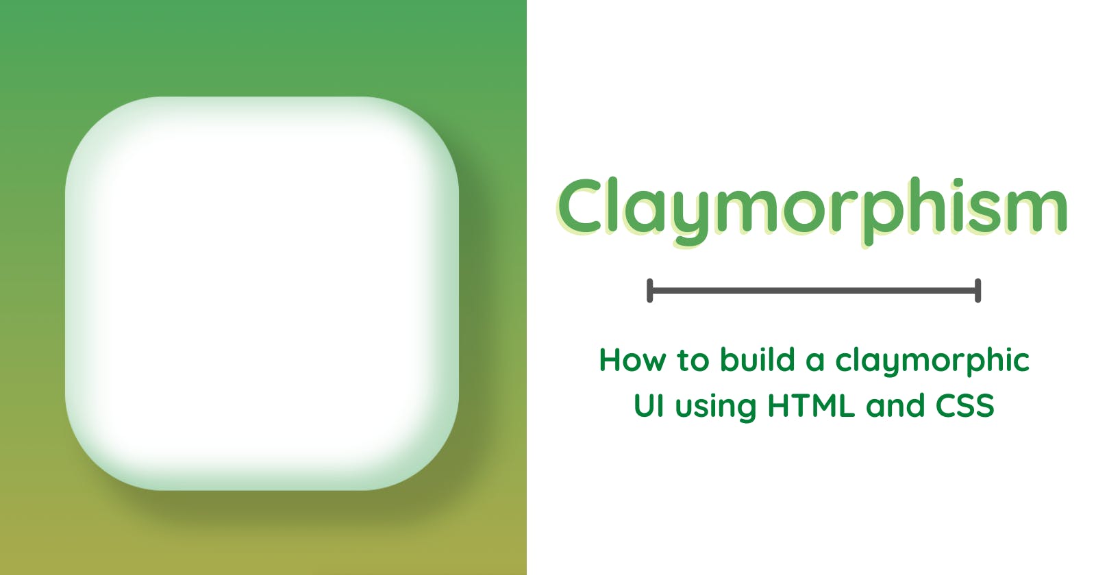
Claymorphism - 2022 UI trend
How to build claymorphic UI using HTML and CSS?! Learn more about this amazing 2022 UI trend.


I always love looking through the UI trends that are going to be widely used each year. Last year we had Glassmorphism which had an interesting design. It was inspired by glass, where UI blocks had the look of glass. This year the new design that is popping up is Claymorphism. Read through this article to learn more about this UI trend and also implement it using HTML and CSS.
Last year we saw a lot of 3D images being used in UI designs on websites and applications. 3D designs are soft, have neat shadow details and a lot of depth to them. They are not flat but are rounded, light, and have a playful and friendly feel to them. Claymorphism includes all these properties. A claymorphic element has inner and outer shadows which give it a light and fluffy look like a cloud. Also, it has softer rounded edges which make the block look inflated.
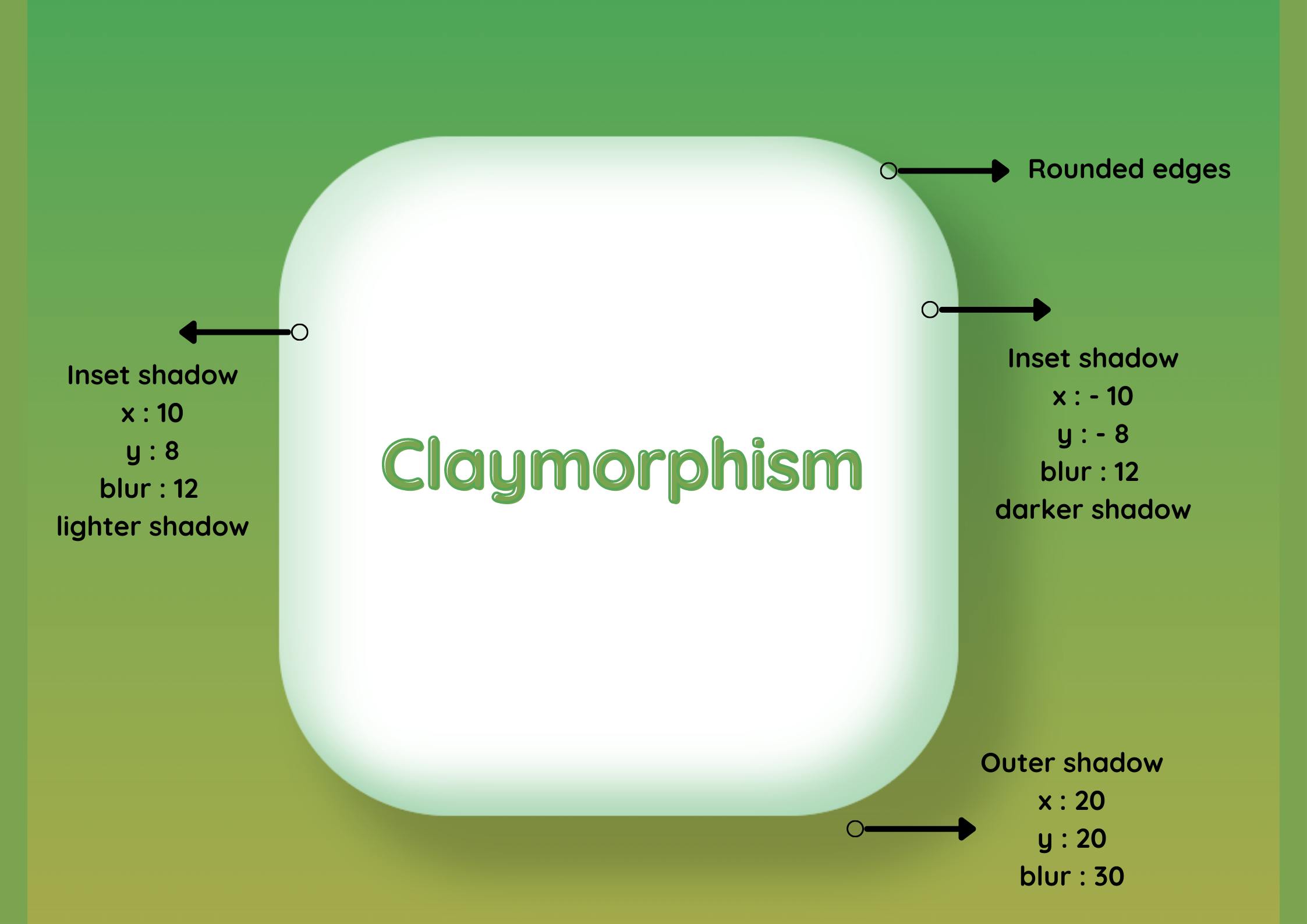
Main elements of claymorphic design
- Big rounded edges.
- First inner shadow has a slightly dull color tone that covers the top and left inner sides of a block.
- Second inner shadow has a color a little darker than the first inner shadow. This is placed at the bottom and right inner sides of the block.
- Outer shadow for the block gives a nice effect that will lift up the design. Outer shadow is more spread out and is given the same
xandyvalues. - To give it an inflated look, the edges are rounded and the sides of the block are puffed out like a dome.
Below is a pictorial representation
Code
Let us now look into building the UI element using CSS
border-radius: This property is used to round the edges of the element. Give a value that is slightly larger, the element needs to look light and soft.background: Choose the right color for the background of the element.box-shadow: This is the most important property of the UI element. Two types of shadows are needed which are inner and outer shadows. To give the element an inner shadow specify the keywordinset.
Now that we understand the CSS properties needed to build the element, let us look at the code.
.block{
  background:#fff;
  border-radius: 25% ;
  box-shadow: 20px 20px 16px 5px rgba(0, 21, 16,0.2),
inset 12px 8px 16px 5px rgba(60, 165, 92,0.2),
inset -12px -8px 16px 5px rgba(60, 165, 92,0.4);
}
Points to note
- Choose the right background. The best suited are bright colors that are soft and playful. As the claymorphic element has shadows that elevate its features, choosing the right background which compliments the shadows is vital. Solid color, gradients, and images are usually used as backgrounds.
- Right colors for the block which have a claymorphic look are also important. Light colors are most widely used. They are pleasant to the eye and also suit the playful, fluffy look that is needed for such an element.
- Give appropriate depth and spread for the inner and outer shadows. Also, note that the color for the shadows must match and compliment that of the element.
- Rounded edges are key to making the element look fluffy and light. So do not restrict yourself to giving smaller rounded edges.
- Give no borders for the elements.
We have successfully built an element that follows the design concepts of claymosrphism. After building the sample, I wondered about the different ways it can be used in building websites. Here are a few ideas :
- UI cards
- Button elements
- 3D illustrations and icons
- As an element to hold form elements
I have built two different types of UI elements using claymorphism. Take a look at this codepen demo to get an idea of using this new UI trend.
Let me know your thoughts about this article!! I write blogs about Frontend and also tweet often. Follow me on Twitter
Cheers 🎊