Building a style guide for your project
Best practices to follow to create a style guide for your website that can be used by designers and developers.


Are you a designer or a developer? Do you have a style guide you refer to while building a project? If not, then this blog is for you! Follow along to understand what style guides are and why are they important.
I am a front-end developer and love designing and writing styles for a website that I am creating. I started my frontend journey by replicating designs from Dribble to live code to practice and get better at writing CSS. This way, I learned from both worlds: Design and Development. When I started designing my own websites is when I realized the key role a style guide plays when developing a website. So here I am sharing my learnings with you!
What is a style guide?
A style guide is the design documentation for your project. This document establishes the standard styles that must be used in your project to ensure uniformity and structure. It contains specific rules for color, font size, etc that must be used when building a project to maintain consistency throughout.
Why is a style guide important?
- It brings uniformity to your project. No elements will feel out of place.
- Style guide extensively supports reusability.
- Consistency is seen throughout all elements and pages of the project.
- Do not go with the method, less is more here. Specify as many details as needed. It includes do's and don'ts, examples, tips and edge cases.
- When working in a team of designers and developers, it is easy to maintain the project by enforcing the use of a style guide.
- Style guides are detailed and also cover corner cases making it easier for a developer to follow through.
- It cuts off friction and saves time between design and development teams.
Let's build a style guide
The first point we have to note is to understand the project we are building. Before starting to create the style guide, first, make sure to build the design. Then based on the design developed, start creating the style guide.
Let us now look at the basic and most needed styles that must be included.
1. Color palette
Choosing the right colors that represent your brand and project are very essential. The colors selected must also complement each other well. Do not go overboard bringing in lots of colors to the project. Target for a clean and consistent look.
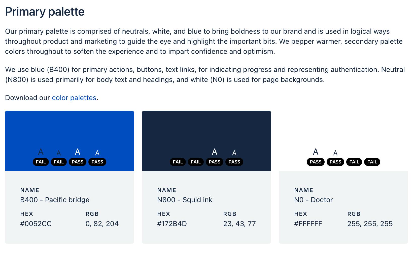
In the style guide, make sure to fill the color in a square or circle placeholder. Along with the color also mention the HEX and RGBA values. Make sure to note when to use which colors. It is better to make them into sections like Primary palette, Secondary palette, Background, Alerts etc.
Here is an example of the color style guide that is used by Atlassian.
2. Typography
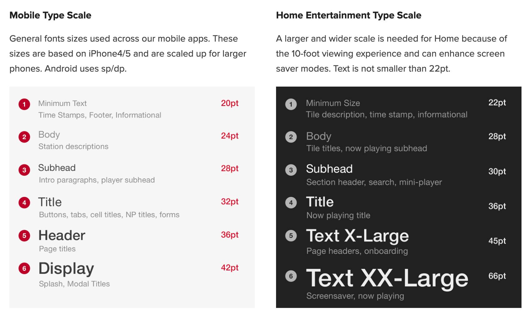
Next up is the usage of fonts. Properly selected typefaces pave the way for making the content look neat and effective. Here are a few things to follow:
- Specify the typefaces that will be used in the project.
- Make a note of font size and weight for different cases like Heading 1, Heading 2, paragraph, etc.
- Line height and letter spacing must be clearly represented.
Take a look at this guide from iHeart
3. Iconography
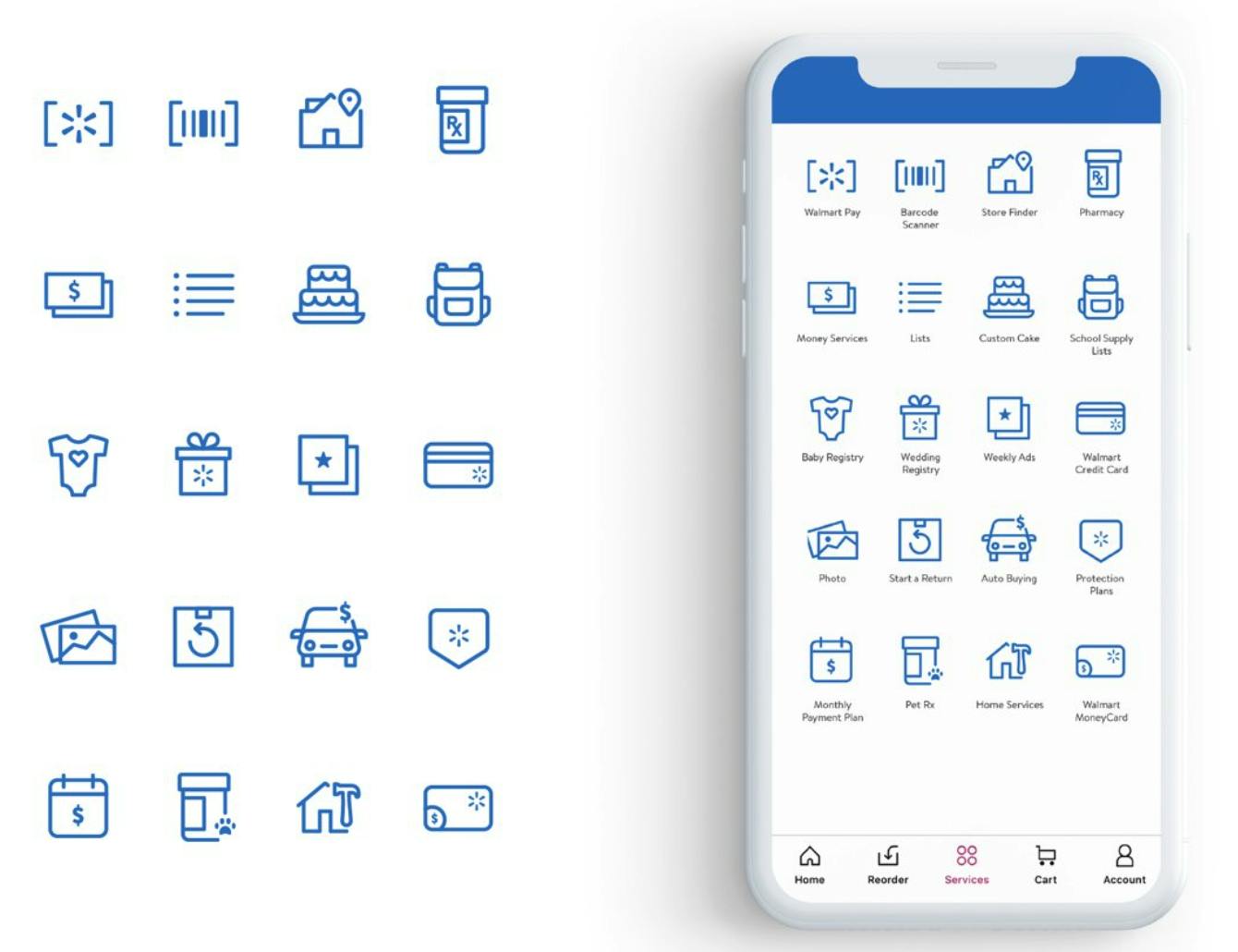
Icons are used to make the content appealing and easily understandable. Picking the right icons that match the theme and tone of the product is essential. Any icons used, must be specified in the style guide. Specifying the Do's and Dont's is helpful as it avoids confusion and negates developer assumptions.
Here is how Walmart specifies Icons and how to use them.
4. Logo and Imagery
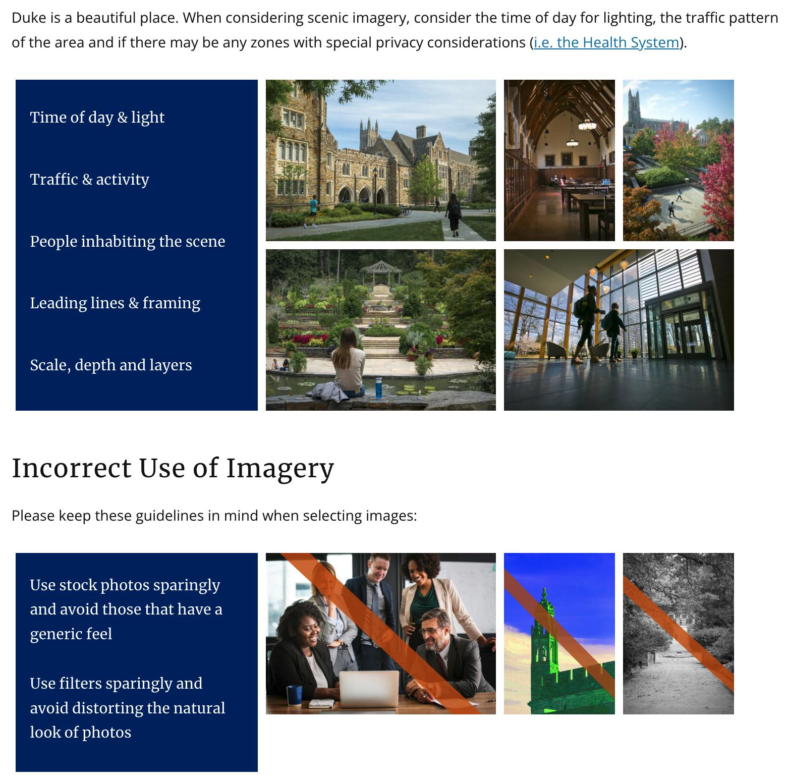
A logo is essential for a product as it sets the brand. Often there are shorter logos and also longer ones. At such times, specifying when to use what logo is important. Choosing images that are in harmony with the theme of the product is like magic. Right images that convey business points and fit right with the context bring a lot of traction toward the product.
Check out this example of how Spotify specifies logo uses.
Take a look at an example of using Imagery. Make a note of how this guide has specified the incorrect way of using images.
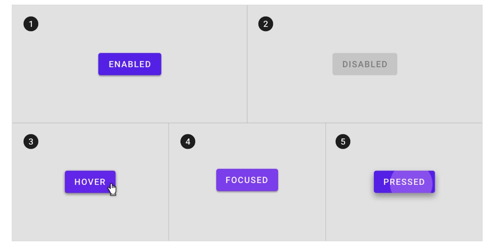
5. Buttons
Call to action is a major detail when building a product. Buttons are how people interact with your website to get information and opt-in for services offered. There are various types of buttons like contained, outline, text, and icon buttons - as per Material Design. This is one very good resource to understand designs and use them in products.
- In the style guide specify primary, secondary and tertiary buttons.
- Make a note to represent designs for actions like hover, click, and press.
- Buttons also have states like Alert, Warning, Success, etc. In case your product uses such buttons, list styles for them.
- There are buttons with just icons, also icons and text. Make it a point to list down all such cases in the style guide.
- There will be margins, padding, and style details for the buttons. They can be included as well to maintain consistency in the product.
Here is a reference blog post that goes through various types of buttons and their representation.
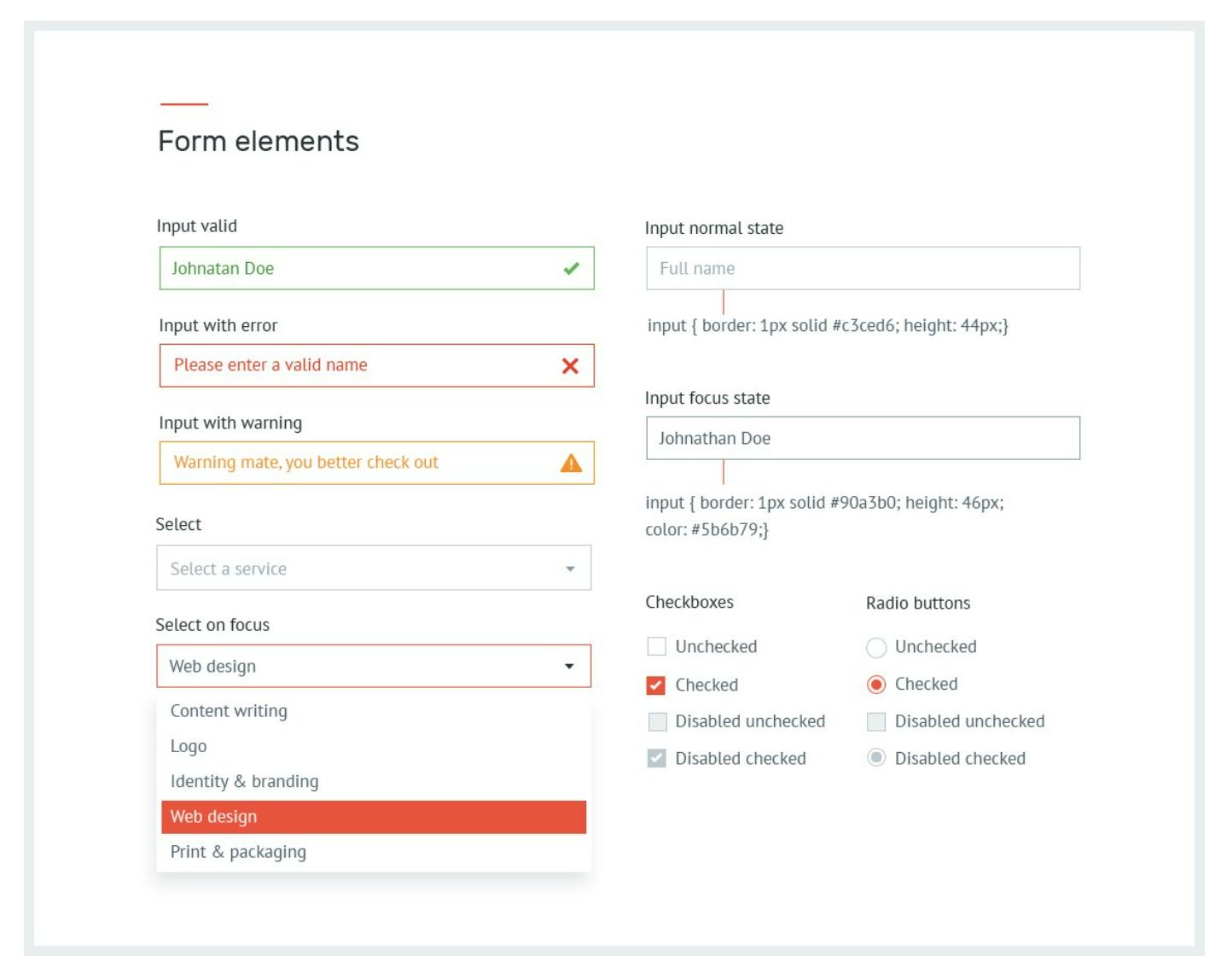
6. Form elements
Form elements must be dealt with a lot of care. People do not like lengthy, unorganized forms which can be time-consuming. See to it that form elements have clear labels, neat designs, and are easy to understand.
- Include padding, font size for buttons
- Add details like errors, and warning for buttons which are useful during error handling.
- Styles for form elements like select, Dropdown, and Radio buttons must also be included.
Below is an example:
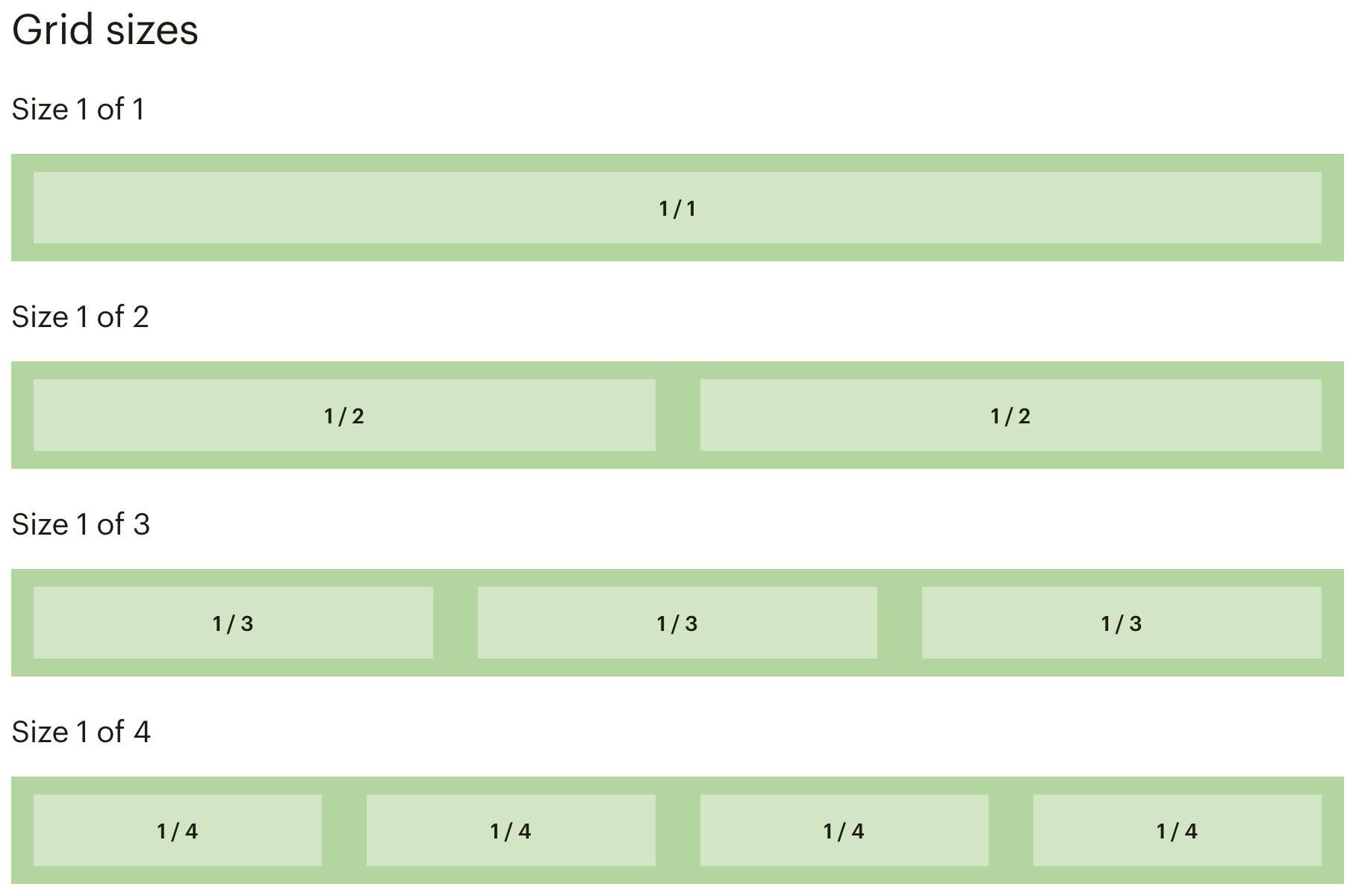
7. Grid systems
There are grids and flex boxes that any design will have to provide a better structure and appealing look. Another benefit of using grid is ensuring responsive design. Let us go through the points to better structure a style guide for grids
- Mention a container size. Eg: 1290px, 1500px
- Take into account the number of rows and columns. Note that this might be different for particular designs. For example, you will have different numbers of rows and columns for a container with an image and text whereas a different row column count for a grid of images.
- Margins and gutter dimensions must be specified as well.
Example of grid system from Mailchimp
Let's go!! Get started now by creating a style guide for your project!
Here are a few resources that can be helpful
That was my two cents about the topic. I am currently in process of creating a style guide for a project I am building at work. It feels tiresome at the start, but remember it saves a ton of time and brings professionalism to the project.
My Twitter. Let's catch up!! Hope you had a nice time reading this article. I would love to know your views on the same!
Until next time 😊