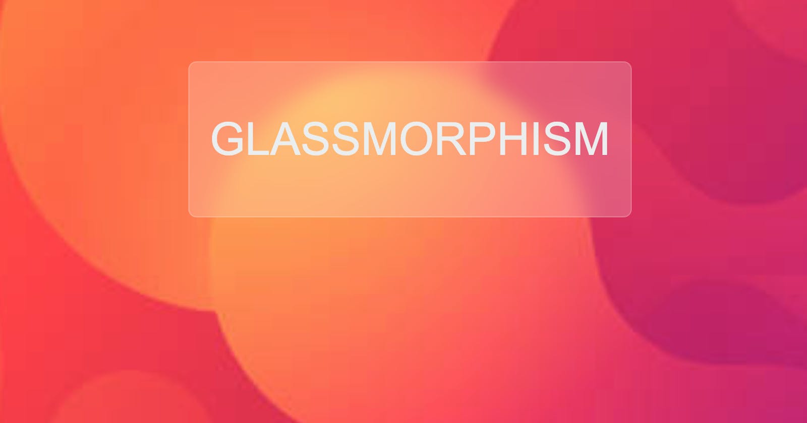
I recently stumbled upon a design on Dribbble and learned about this new UI trend that has caught a lot of attention. Read through to find out about Glassmorphism and how you can implement it using HTML and CSS.
The name itself is a giveaway - Glassmorphism. This UI element is designed to resemble the feature of smooth glass. The basic idea is to blur the background of the element to give a transparent glassy look.
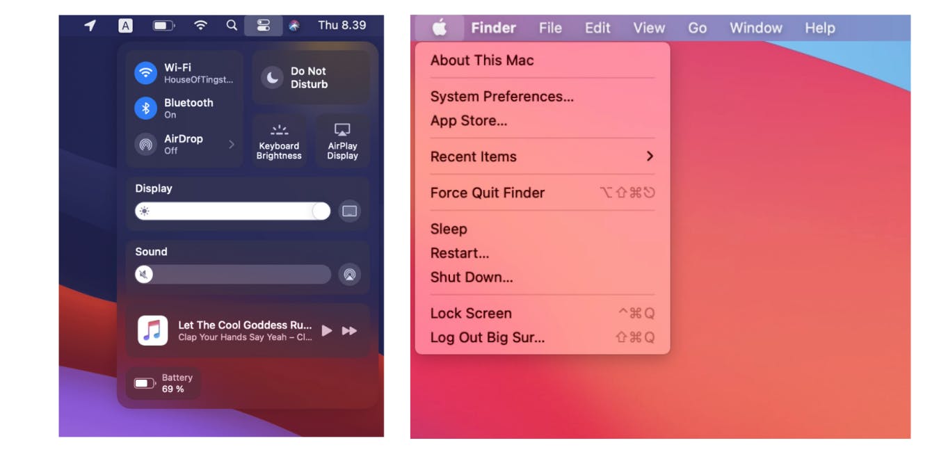
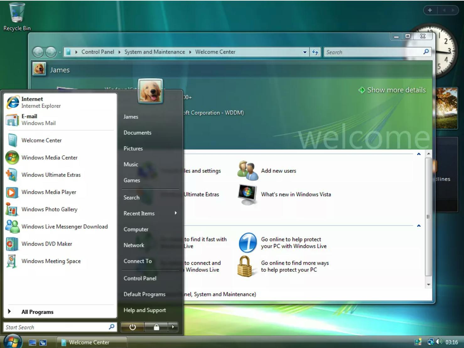
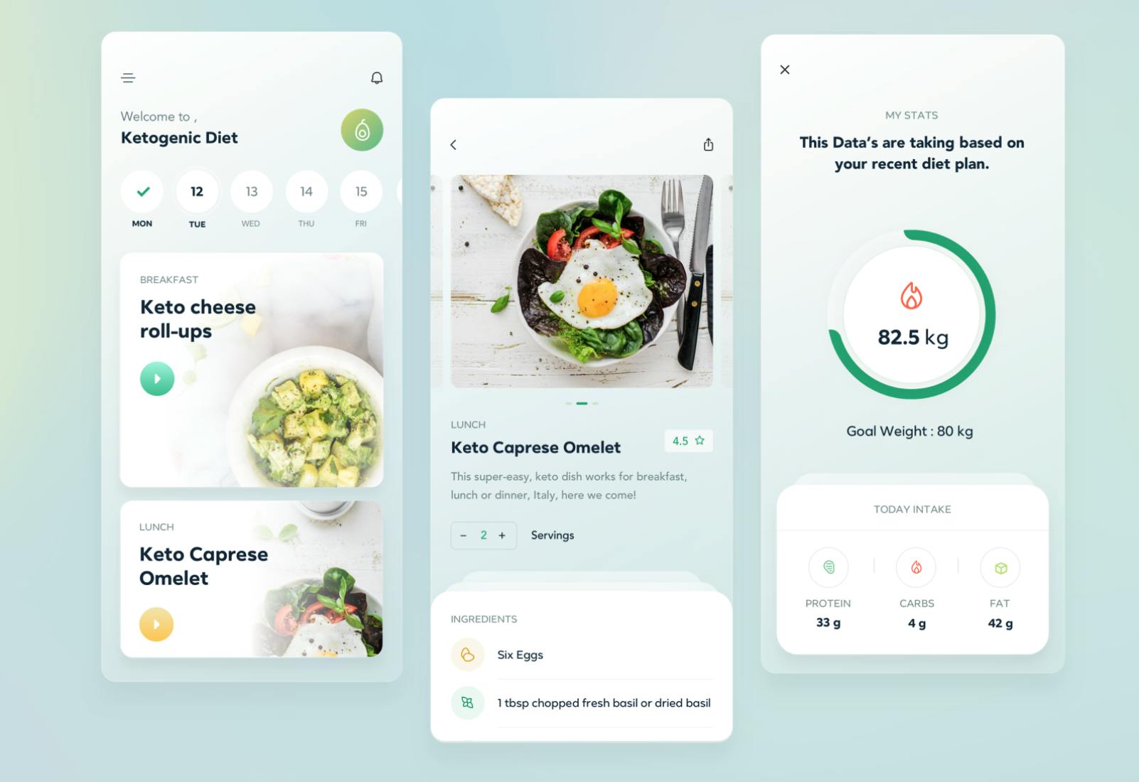
Before we dive into some code, let us look at some examples.
- MacOS Big Sur
- Windows Vista
- Dribbble design by Praveen Raj
Design features of Glassmorphism
Here are a few features of the design that contributes to building a crisp neat glass look.
- Transparency: Setting a light transparent background for the element is important.
- Blur background: Making the background blur gives a layered effect. You can give a frosted glass feel by increasing the blur effect, giving it more depth.
- Choosing the right background: A colorful vibrant background for the parent is ideal for glassmorphism. A bright gradient of colors that work well with each other is a good choice. You can also choose a background that has good edges and features like circles/blob details. Using such images work well because, when you place the glass element with a slight blur effect on top of it, the edges in the background add a good look and depth.
- Border: Add a small border of 1px or 2px to the element to give it a clean glass edge detail. You can also choose not to add a border, although I prefer the border as it gives a good look.
Great!! We now know the design aspects we need to make a good UI with glassmorphism. We will now use HTML and CSS to build a basic implementation of this new UI trend.
Code
Let us break down the HTML elements first. We only have two elements. A <body> which is a parent and another <div> which is the glass. Simple right?!
CSS is next!! Important things to remember are transparency, blur effect, and good background. We are set.
Check out the two CSS properties we will be using
background: Using this property, we will be adding transparency to the element. Color white will be given using rgba format. We will be increasing the "alpha" value to give a transparent background.backdrop-filter: This property is used to add a blur effect. It can do changes to contrast, brightness, and perform color shifting. These changes are applied to everything behind the element. For this effect to work, one important detail is the transparent background of the element. The value is given inpxvalues. The higher the value, the greater is the blur effect. You can make the glass feel like frosted glass by increasing the value of blur. Let's look at browser compatibility: It works on Chrome, Edge, Firefox, Opera, and Safari. It is not compatible with Internet Explorer and Firefox for Android. Link to MDN docsbackground-clip: This CSS property is related to the background of the element. With this, you can decide if the background of the element extends underneath its border-box, padding-box, or content-box. Since we will be giving a slightly different border color to get the 3D effect of glass, the proper value to be used ispadding-box. Coming to browser compatibility, it works on all the different browsers available. Link to MDN docs
Here is the CSS for the glass element :
      color: #ecf0f1;
      border-radius: 8px;
      padding: 20px;
      background: rgba( 255, 255, 255, 0.2 );
      border: solid 1px rgba(255,255,255,0.3);
      backgroud-clip: padding-box;
      backdrop-filter: blur(10px );
Have a look at this codepen for a simple implementation of Glassmorphism:
After I built a basic implementation of glassmorphism, I kept wondering how to actually make use of it in a webpage. While building a webpage that uses glassmorphism I had a few learnings that I would like to share with you.
Glassmorphism is basically a decoration for an element. So the best ways to use it are for cards, notification bars, or any block that holds the integral elements of the UI. Do not use it for CTA elements, as they don't pop!
When you are thinking of layering the glass elements, make sure to change transparency and blur values to give a multi-layered effect.
Choose a background that is colorful. A simple or dull background will not bring out the effect of glass on the UI. Look at the example of Big Sur and Windows Vista, they have a vibrant background that brings out the glass details of the element on top of it.
Alright! With that done, do check out this webpage that I built that uses this new UI trend here.
The code is hosted on my Github. Below is a screenshot of the webpage.
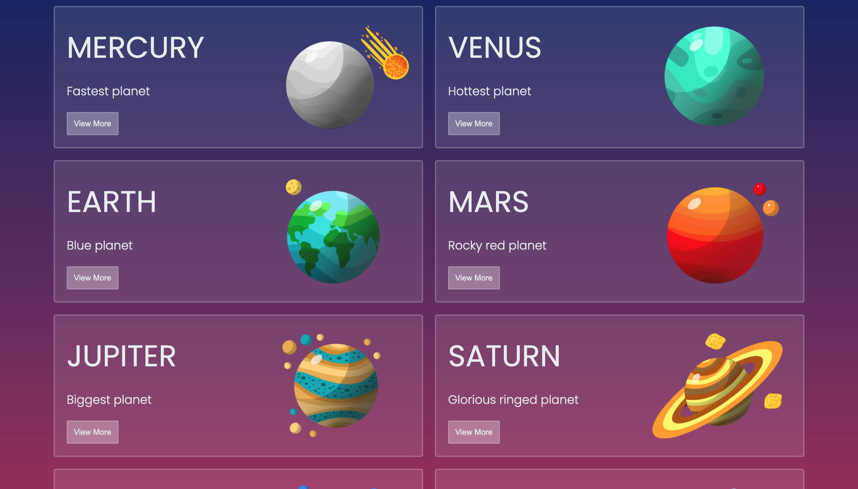
Illustration from Freepik. Credit to macrovector.
That's a wrap!!
That was my take on Glassmorphism. We discussed what makes this style distinct and also looked at ways to re-create the effect using HTML and CSS. We cannot yet tell if this is going to be the next big thing in UI, as it has a few limitations and works well only in certain cases. But like all new UI trends, it has taken the interest of designers. You can take a look at a few cool designs on Dribble, Behance to get inspiration and build one of your own!
Hope you enjoyed this article. For more articles like this, follow me on Twitter. Until next time ^_^
